World Opportunity Set
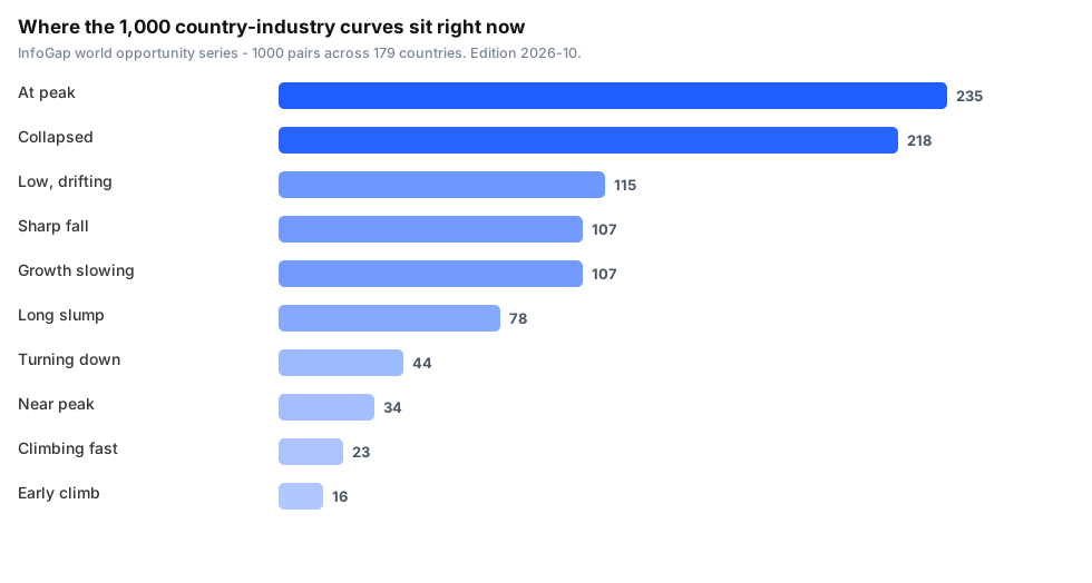
1,000 country-industry pairs read as curves: score, stage, direction, slope, acceleration and remaining space.
Size tells you nothing about timing. This tells you which markets are still climbing and which have already turned.
Sort to your industry, compare countries on one scale, cut 1,000 down to a dozen worth real research.
CSV (1,000 x 15) + JSON. Instant download, yours to keep.
Countries and industries, read as curves instead of snapshots — so you can tell a market that is still rising from one that has already turned.
According to InfoGap's world opportunity series (source: InfoGap's own records; definition: one row per country-and-industry pair, carrying a 0-100 opportunity score, a stage label, a direction, a slope and an acceleration figure; as of 2026-10-10), 1000 country-industry pairs are recorded across 179 countries and 87 industries.
What is inside
- A score per pair — 0-100, on one scale across every country and industry.
- A stage label — where the market sits in its own cycle.
- Direction, slope and acceleration — not just where it is, but which way it is going and whether it is speeding up.
- Remaining space — how much room our model reads above the current level.
- English and Chinese labels side by side on stage and direction.
What it is good for
- Comparing an industry across many countries on one scale, in one sort.
- Spotting markets still on the way up versus ones already falling.
- Screen first, then go deep — the file is a shortlist tool, not a dossier.
What it is not
- Not investment advice, and not a forecast. It is a reading of recorded series.
- Country names are recorded in Chinese; each row carries the ISO code so you can map it.
What people use it for
- Screening countries for one industry. You sell into, or are expanding into, a specific sector. Sort the 1,000 pairs down to your industry and see which countries are still climbing and which have already turned.
- Avoiding the market that already peaked. Most data tells you the size. The stage and direction labels tell you whether you are late.
- Comparing the same industry across countries. One scale, one sort - instead of 179 separate reports.
- Building a shortlist for deeper research. It is a screening tool. You use it to cut 1,000 down to 12, then go and do the real work on those 12.
Who it is for: people deciding where to expand, and analysts who need a first cut across many markets at once.
Licence
Commercial use permitted — use it in your own analysis, products and decisions. You may not resell or redistribute the dataset itself as a dataset.