Is this business steady, yellow-flag or red-flag? One number plus one reference tells you
One of our published methods, written in plain language: what it can do, when to use it, what goes in and what comes out.
Most methods are published as papers or code. This one is written so you can decide whether it fits your problem before you invest time in it.
Read the page top to bottom. If it matches your question, use the online tool - or subscribe and run it on your own data.
A clear answer on what the method does and does not do, plus a live curve from our own demand series. Free to read.
1In one line: what it does
Give it a number and give it a reference, and it tells you on the spot whether you are steady, yellow-flag or red-flag — and says straight out what to do.
2When you would use it
Three situations where it helps:
3What goes in · what comes out
Input (the set below is the one from the real run)
· Current value: 150
· Reference value it should sit against: 120.22 (the average across other cities in the same industry)
· Direction: improving (that means moving up)
· Name of this number: Chongqing gym gap score
What comes out
These numbers are what it produced on the spot, with not a character changed:
24.8% above the reference
Direction: improving ↑
Verdict: 🟢 Steady
What to do: hold as you are, monitor as usual

—— same rules, a different set of numbers (current value changed to 40, direction changed to worsening) ——
66.7% below the reference
Verdict: 🔴 High risk
What to do: act immediately, urgent intervention
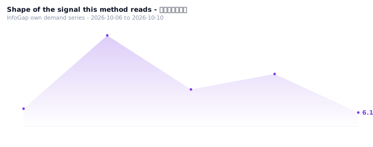
📈One chart: over these 35 days, what lights the industries showed
Counted per day, of the industries being watched, how many were on green and how many were flashing yellow or red.
4How to use it
There is no public calculator for this yet — the method above is the whole procedure; on this site the inputs have to be keyed in by hand.
- Take the row you want to look at from the city × industry gap table
- In the "risk" column, compare that row's number against the reference it should sit against
- Read off the colour and the one-line action
5Who it is for
Shop owners who record one number every week; people who need to see which of several cities or industries is deteriorating; people who have the data but cannot pin down a "normal range".
6Common questions
7Related algorithms
✓Why this scenario exists (where the content comes from)
This scenario comes from the record left by the "algorithms hitting demand" round: the Chongqing · gym demand was put up against 5 algorithms, and the risk grading one was judged "useful", the reason in the original wording being "deviation rate × trend direction → four levels. Trend +0.5 → improving/stable; -0.5 → worsening/high risk. The ledger already held the value and the direction".
The input and output above come from re-running the exact set of numbers in that record: Chongqing gym gap score 150, reference 120.22 (the score on row 44 of the gap table), direction improving.
Source: row 44 of the in-house city × industry gap table (Chongqing, gym, score=112.66, direction=up); the paired match ledger (schema hit.v2), group D4.