Is this industry still worth entering? Three scores give the answer
One of our published methods, written in plain language: what it can do, when to use it, what goes in and what comes out.
Most methods are published as papers or code. This one is written so you can decide whether it fits your problem before you invest time in it.
Read the page top to bottom. If it matches your question, use the online tool - or subscribe and run it on your own data.
A clear answer on what the method does and does not do, plus a live curve from our own demand series. Free to read.
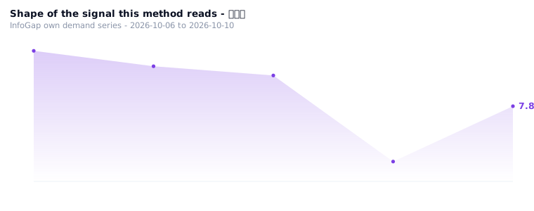
Data base: InfoGap own records - 391 Chinese cities x 8 dimensions, 213,208 city-industry rows, 40,499 POIs (central / lifechain, 2026-10-08).
1In one sentence: what it does
Scores an industry from three angles — does it decide on data, will new technology replace it, how high is the barrier.
2When to use it
You are most likely in one of these three situations:
3What goes in · what comes out
Input: a score for each of the three angles (0–100 each) plus two supporting numbers (this is the set used for the real run)
- Does it decide on data — 62
- Will new technology replace it (the higher, the safer) — 45
- How high the barrier is (the moat) — 58
- Data quality — 62
- How digital it is — 55
What comes out
Output: the raw run, as it came out (not a character changed)
The three angles:
  Data-driven   62 points (weight 0.4)
  Replaceability 45 points (weight 0.3)
  Entry barrier  58 points (weight 0.3)
Total (weighted): 55.7
Conclusion: 🟡 Data-replaceable — an industry in digital transition, facing replacement risk, needs to transform
Vitality: medium
📈One picture: is this industry still worth entering
Three angles scored; see whether you can enter, need to change, or should stay away.
4How to use it
There is no public calculator for this yet — the method above is the whole procedure; on this site the inputs have to be keyed in by hand.
- Score each of the three angles (0–100)
- Work the weighted total out with the weights above
- Read the total score, the conclusion colour, and the vitality grade
5Who it is for
People about to enter an industry; people who have worked in one for a few years and feel it changing lately; people who look at projects for other people.
6Common questions
7Related algorithms
✓Why this scenario exists (the evidence)
Why this scenario exists:
The site has a city × industry opportunity-gap table produced by a real run: 50 rows, running down from a score of 120.22 (Beijing, 13 industries) to 112.66 (Chongqing), every row marked "industry direction = rising".
But that table only says "where the demand is", not "whether this industry can take a hit itself" — which is why this algorithm exists, to supply the other half.
Source: the site's city × industry opportunity-gap table.