One number alone shows nothing — log it three times and it becomes a line
One of our published methods, written in plain language: what it can do, when to use it, what goes in and what comes out.
Most methods are published as papers or code. This one is written so you can decide whether it fits your problem before you invest time in it.
Read the page top to bottom. If it matches your question, use the online tool - or subscribe and run it on your own data.
A clear answer on what the method does and does not do, plus a live curve from our own demand series. Free to read.
Data base: InfoGap own records - 391 Chinese cities x 8 dimensions, 213,208 city-industry rows, 40,499 POIs (central / lifechain, 2026-10-08).
1In one line: what it does
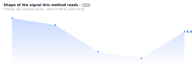
One number logged once shows no problem; log it three times and it becomes a line, so whether it is rising or falling, and whether it has reached a turning point, is obvious at a glance.
2When to use it
These three things are probably happening to you right now:
3What goes in · what comes out
Input: three scores for the same metric + the metric name (this is the exact set used in the real run)
- Metric name — foot traffic
- Run 1 — 40
- Run 2 — 55
- Run 3 — 38
What comes out
Output: the text it produced, not a single word changed
Data points: run 1: 40 / run 2: 55 / run 3: 38
Highest 55 / lowest 38 / average 44.3
Swing: 17
Trend call: run 2→3 sharp decline (-17); turning point: spike then fall back 🟠
Type: spike then fall back 🟠
Conclusion: foot traffic: 3 data points | 🟠 spike then fall back | highest 55 lowest 38 average 44.3 | ✅ curve generated
📈One chart: log it three times and it becomes a line
Log the same number three times and it will tell you itself whether it is climbing or falling.
4How to use it
There is no public calculator for this yet — the method above is the whole procedure; on this site the three numbers have to be keyed in by hand.
- Pick one fixed metric name (foot traffic, revenue, number of people joining a group — any of them will do)
- Record it three times at a fixed interval and write the three numbers down
- Take the highest, the lowest and the average, and check how much moved between run 2 and run 3
- Read the trend type and the turning-point note
5Who it's for
Owners who want to argue with numbers rather than feelings; people who just made a change and want to check whether it worked; people who look at industry trends and want to see where they stand.
6Common questions
7Related algorithms
✓Why this scenario exists (evidence)
Why this scenario exists:
On the site's public trend pages, every industry curve is labelled with its source, and each of the 50 rows in the GEO opportunity table is also tagged "industry direction = rising".
In other words, industry-level curves are already being done by someone; the curve at the individual shop owner's level is the missing piece.
Source: the site's public trend pages, plus the GEO opportunity table (industry direction field).